Logo & sketches
TBS do not want to remove their all-known smile, the idea was to go a step forward and redesign their brand icon. We started exploring differents smile gestures, trying to add some personality to it. We solved it addind a simple shape emulating the tongue, so the laugh feeling is more obvious... and funny!
Distortion
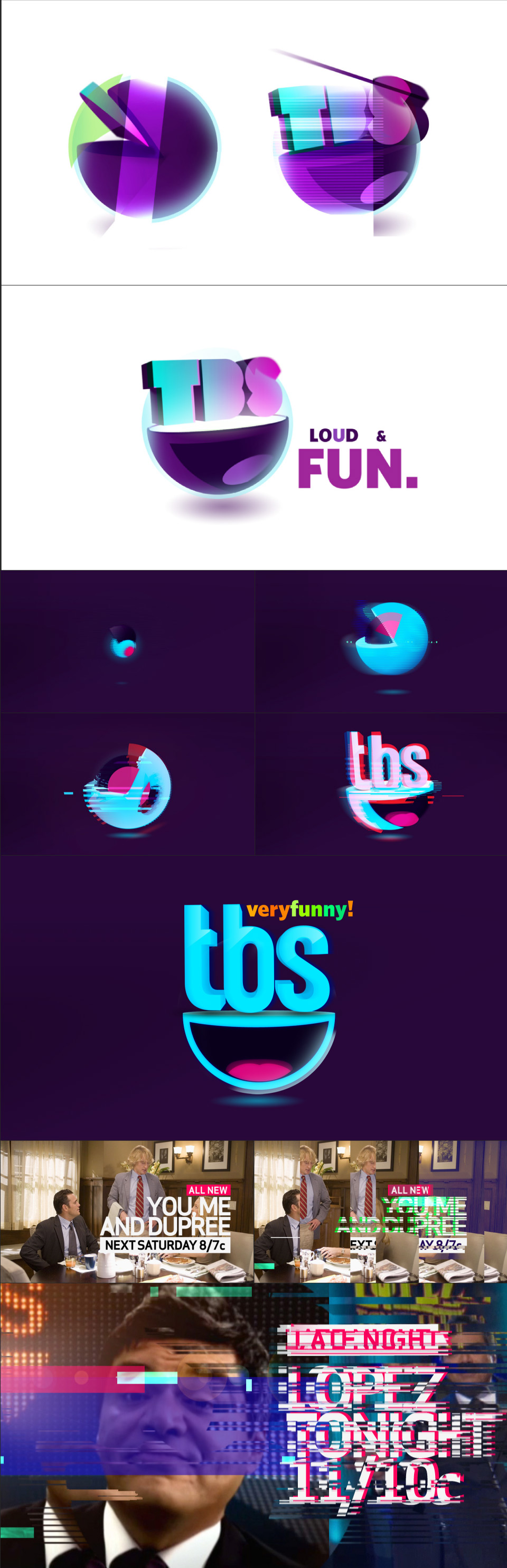
The logo id is definetly one of our faves. We went through a large process, even what is showcased are not the final tests, but the idea remains the same...we used the 'half circle' giving it some volume. This electric shaking sphere push out the TBS letters from the inside. Below the logos, some examples of possible menus and footage distortion.
Other ideas
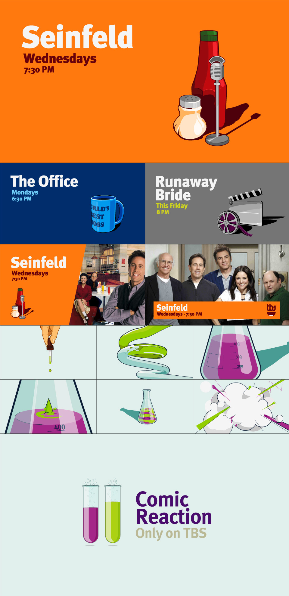
These were some of our first approaches, we illustrate each sitcom more representative object over plain color backgrounds. We decided to use big and clean type texts to give a powerful looking. The storyboard shown is part of another conceptual direction, as if TBS had the secret formula to make you laugh!
Information
Produced for Roger The guys at Roger came along with this huge pitch proposal for TBS. We joined Miguel Seo, a very talented illustrator, and together we faced the challenge. We went through a lot of different aesthetic proposals until we finally matched line and concept. The final deliver was all about distortion, a colorful and designed distortion that surrounds the main characters who get in & out of the screen without asking any permission.Credits
-
Idea & Concept
Roger + HippieHouse
Art Direction
Roger + HippieHouse -
Main Illustrations
Miguel Seo
Additional Illustrations
Chris O' Farrell -
Logo Designs
Chris O' Farrell
Mouth Sketches
Sebastian Brown -
At Roger
Project Manager
Brian Wee
Art Direction
Terrence Lee
All rights reserved © Hippie House